

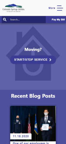
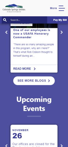
Yes Yes 219251 No Navigation rating 5 I started at Google and found the Colorado Springs Utilities home page immediately as it was the first search result. It couldn't have been easier. 219251 Functionality rating 3 In order to get to any menu options, other than pay my bill, I have to click several things first (for example, More, then Residential, then whatever I'm looking for. It would be good if a few of the key menu options (or the quicklinks that are buried partway down the page were at the very top instead of the scrolling images. The images look nice, but on a mobile device, I care more about functionality than appearance. I really appreciate that the website is mobile-friendly. 219251 Appearance rating 3 The text is really easy to read on my phone, which is awesome. The pictures are nice, but take up too much of my screen. Also, the quicklink options take up almost an entire phone screen for each one. These could be much smaller and would then require less scrolling. 219251 Relevance rating 4 Some of the main options seem a little buried when on my phone (you have to click through multiple menu options). Having more quicklinks available at the top of the page would make it easier and quicker to find what I need. However, the menus are logical and easy to navigate which I greatly appreciate. 219251