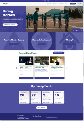
Yes Yes 219250 No Navigation rating 5 The home page was very easy to find from Google. I appreciate that when I click on the logo, I return to the home page no matter where I am on the site. 219250 Functionality rating 3 The scrolling images are great, but take up so much space that even on my large computer monitor, I have to scroll to see the important quicklinks. I love the boxes and icons shown around the quicklinks, but I expected the entire box to be clickable. Instead, I have to scroll down to get to the individual buttons in order to click. Everything else seems to work well though. 219250 Appearance rating 3 The scrolling images add a lot of interest to the home page and the text is very large, making it easy to read. Everything seems a little big though, and I feel like zooming out to 80% is a lot better because then you can see the quicklinks to report and monitor outages, make an online payment, and start/stop service. Otherwise, you have to scroll to see those important options. Also, The boxes around the quicklinks could be half the size they are now. It again goes to the feeling that everything is too large/zoomed in. 219250 Relevance rating 3 I wish there was a login box over the scrolling images because that's the main reason why I visit this website. Otherwise, I get a lot of the most important options directly on the home page (like outages, making a payment, and moving). The Residential menu is short and sweet and has important options. The More menu has some options that I wouldn't know what would be on those pages without visiting them. For example, as a residential customer, I have no idea what Procurement would be in reference to. Maybe make these a little more intuitively named. I would expect Outages to be an option at the very top right on the home page with Contact Us and My Account. Careers is ok, but is much less important than reporting an outage. 219250