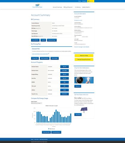
Yes Yes 219990 No Navigation rating 4 I clicked on the Log In option in the Google site links, entered my username and password and was logged in. Very simple process. It would be nice if the login box was directly on the home page as well, but it's still an easy process. 219990 Functionality rating 4 It seems like the main functions I'd want are linked on the summary page, like viewing and paying my bill, updating my account information, and seeing/linking to my energy usage. I'd rather have my energy costs/usage graphs closer to the top of the page and Account Programs and My Pricing Plan could be moved further down as those are things that won't change as much as potentially my energy usage would. 219990 Appearance rating 3 While the appearance is ok, there seems to be a lot of text on the page and not much to differentiate between the lines. It makes it harder to read. I'd suggest breaking up some of the information into more widgets. For example, have current bill information in one grouping and then the last payment information in another grouping to visually separate them. Otherwise, it's harder to quickly see what I owe and when. 219990 Relevance rating 3 The information provided is relevant, but as I mentioned earlier, the order in which it's presented could be better. There's a link to download usage at the very top and then other options to view data table and download report at the bottom. What's the difference between these options? I like that I can sign up for account programs on the summary page, but without a description of what they are, it's hard to tell what would be helpful for me to enroll in. Having a link with a description would be very helpful. 219990