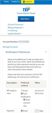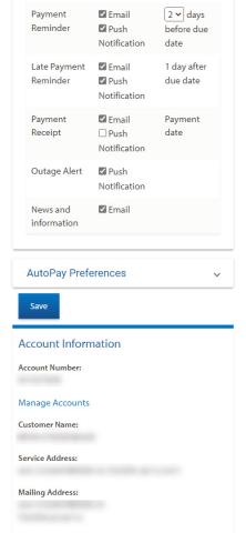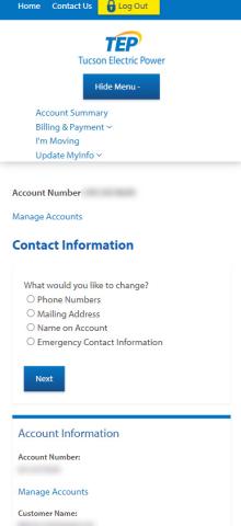


Yes Yes 219985 No Navigation rating 4 After logging in, I clicked on the menu and originally thought the account summary would be what I wanted. However, I was wrong and didn't see the Update MyInfo lower on the menu. That clearly was what I was looking for. It would be nice if all the notifications and personal information updates were on the same page, but it's not too hard to go between them. 219985 Functionality rating 2 Updating the notification and alerts options is easy. I like that you can just click the check marks to turn them on/off. I don't like how you update personal information. For my contact information, why do I have to select which piece of information I want to change and then go through a survey-like process. Every other website I use allows me to see all my information and then click edit next to the piece of information I want to update. And if I want to update that information for only bills for example, it would ask me that afterwards. This process seems cumbersome. 219985 Appearance rating 3 I think the reason I didn't see the Update MyInfo option in the menu originally is because My Info is so close together that it looks like one word when it should be two. The overall look is fine otherwise. The text is a little small on a mobile phone. 219985 Relevance rating 4 I'm able to update most of the information I'd want to update on my online profile. I like that there are a lot of payment and billing reminders and alerts that I can sign up for. It would be nice to have usage alert options too. For example, if my usage is higher than last month, I'd get an alert. 219985