We recently revealed the results and rankings from the 2019 E Source Review of North American Electric and Gas Company Residential Websites, also known as the Website Benchmark study. Conducted every other year since 2002, the study got a facelift in 2019. This year, we used an updated, more quantitative methodology that analyzed more data points than ever before.
Before going into more detail about the updated methodology, here are the top 20 utility websites with the most user-friendly web experience of 2019. You can view the full rankings of the more than 100 websites that we analyzed by reading the press release, and E Source utility members can watch a recording of the Rankings from the 2019 Website Benchmark web conference, held in August.
| Rank | Utility | Score |
|---|---|---|
| © E Source (2019 Website Review) | ||
| 1 | KCP&L | 597 |
| 2 | SRP | 596 |
| 3 | ComEd | 593 |
| 4 | NV Energy | 585 |
| 4 | PECO | 585 |
| 6 | PSEG Long Island | 579 |
| 7 | BGE | 578 |
| 8 | Pacific Gas and Electric Co. | 576 |
| 9 | Duquesne Light Co. | 569 |
| 10 | DTE Energy | 564 |
| 11 | Georgia Power | 563 |
| 12 | Consumers Energy | 562 |
| 13 | BC Hydro | 559 |
| 13 | AEP Ohio | 559 |
| 15 | OUC | 558 |
| 16 | Alabama Power | 557 |
| 17 | Public Service Electric & Gas Co. | 556 |
| 17 | Colorado Springs Utilities | 556 |
| 19 | WPS | 553 |
| 20 | PPL Electric Utilities | 552 |
An updated method of scoring utility websites
This year’s study gave us a more complete look than ever at the usability of utility websites, with clear differentiation between companies that put an emphasis on the mobile user experience—which often lags behind the desktop experience—and those that didn’t. Ultimately, a clear focus on customers’ priorities is what really set the best-performing websites apart.
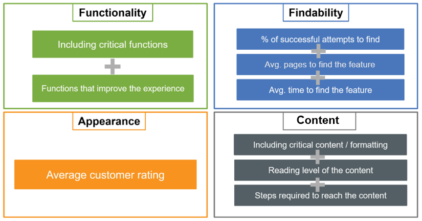
We’ve shifted to use a more quanititative methodology than in years past, with the result of providing more-actionable, data-heavy feedback for each website. We looked at four usability components to determine the scores.
Measuring participants’ websites with this new usability criteria allowed us to identify the websites that offer robust functionality, an intuitive user experience, and an appealing, coordinated design. KCP&L and SRP, the two most usable utility websites in North America, stood out as going above and beyond in each usability component to create an optimized experience for their customers.
In the next couple months, we’ll begin releasing design guides—feature-by-feature analyses of what makes web functionalities the most effective for customers. The guides will include screenshots of best examples and dos and don’ts. If you’re not currently an E Source E-Channel member and your utility is listed in the rankings, you can schedule a discovery call for more information on how to obtain individual results.
